A wide variety of cameras, instruments and sensors are installed in satellites currently orbiting the earth. The data provided from these sources are of great use to surf forecasters. The payloads provide nearly live coverage of weather events around the globe. They capture images of land, sea and clouds, measure wave heights, sea temperature and elevations, wind speed and direction. Each piece of data contributes to developing an overall assessment of global weather and surf generation potential.
Geo-synchronous satellites, positioned about 18,000 miles above the earth, rotate at the exact same speed as the earth, and thus appear to remain in a fixed position over one place of the globe at all times. Key geo-synchronous satellites include: GOES-8 over the West Atlantic Ocean, METEOSAT over Europe and the eastern Atlantic, GOES-10 over the East Pacific Ocean, GMS-5 over the west Pacific Ocean, and INDOEX over the Indian Ocean. . These satellites provide great 'pictures' or images of atmospheric conditions, updated hourly. Satellite images are laid out much like looking at a globe or map. North is normally at the top of the image, south at the bottom, east to the right and west to the left. Often the images are posted with some sort of an overlay applied, that outlines major landmasses and provides latitude and longitude lines or markers. Without these features, it's very hard to determine how far away significant weather features are from land, making them nearly useless to surf forecasters.
There are 3 types of images produced from instruments on these satellites of use to surfers: Visible, Infrared and Water Vapor. These images are used to determine the presence and structure of existing storms and give surf forecasters some indication of the swell generating potential for a system. Obviously the larger and better organized a storm system is, the better the probability for a swell. Conversely, if no significant cloud mass is present, odds are low any swell will be generated in this region. Generally the images don’t provide specifics about the storm (surface wind speed, direction, seas heights etc) but are great for generating a macro level atmospheric/surf potential assessment for the moment in time the image was taken.
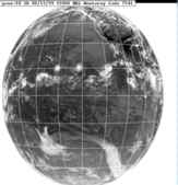
Visible imagery (VIS) is obtained much like taking picture with a normal camera. It uses sunlight to illuminate the subject, and in this case, that subject is clouds. These images typically show detail of weather events both at the surface of the earth and high in the atmosphere. But visible images are only of use when taken during daylight hours because they require sunlight to make the image exposure.
Visible Full Globe Satellite Image
Notice that half the image is shrouded in darkness
Image Courtesy: Naval Research Laboratory
Infrared (IR) satellite imagery uses processes that rely on temperature differences to distinguish between objects, in this case, cloud tops. Very high cloud tops are indicative of strong storms. These cloud tops are very cold, and therefore show up in these images as bright white. Less energetic system are depicted in gray (because the cloud tops are lower and warmer). Land and oceans are nearly black (comparatively very warm). The one great advantage of infrared imagery is it can be obtained 24 hours a day, with or without sunlight. Because of this feature, one can view developing storms throughout their lifecycle, essential for accurate surf forecasting. This makes infrared images ideal for viewing in time-lapse loops. Time lapse images are like a movie, showing weather features evolving over time.
Infrared Full Globe Image
Same date and time as image above. Notice 2 hurricanes just north of the equator and a storms in the south Pacific now become 'visible'.
Image Courtesy: Naval Research Laboratory
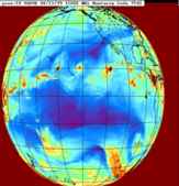
Water Vapor (WV) images show the flow of water vapor through the atmosphere. These images are good for viewing jet-stream and upper level systems and water content in clouds, but do little for analyzing surface features.
Water Vapor Image
Again, same image as above, this time focused on Water Vapor. Notice concentrations of vapor in the hurricanes and with the cold front in the storm in the south Pacific.
Image Courtesy: Naval Research Laboratory
So geo-synchronous images are good for doing high level analysis of potential swell producing storms, but they're only just the start. They cannot tell you details about what is going on inside a storm at the ocean's surface, essential for constructing accurate surf forecasts.
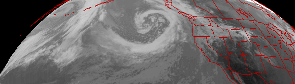
But lets answer the question: What does a storm look like? Basically it looks like a big swirling mass of clouds. Whether you're viewing static satellite images or time-lapse, storms are readily apparent. The first clue that a storm has either formed or is forming is the presence of a large cloud mass. In any of the image spectrums (VIS, IR, or WV), clouds stand-out as either a large white or colored blobs. If you can't see any black (land or water) through the clouds, then the cloud mass is dense. The denser the better. In VIS and IR images, the brighter white the clouds appear, the denser and higher into the atmosphere the cloud tops are. Strong storms are characterized by penetrating high into the atmosphere and by displaying obvious signs of rotation. Based on our previous discussions, moisture laden warm air is displaced upward by approaching cold air. A lot of uplifting of warm air means a stronger storm. Warm air can be pushed over 30,000 ft upward in a well-organized system. As one moves up into the atmosphere, air temperatures decrease. Warm humid air that is quickly forced up eventually encounters colder air, and the warm air starts to cool. Eventually the moisture in the warm air starts to condense and falls-out as rain. The more uplifting the wet-warm air experiences, the greater the rainfall. One can generally attribute the bright white presence of clouds in IR images with rainfall.
Two Storms (Infrared)
Notice two 'swirls' of clouds. One just off the coast of the NW US (center of the image) and a second larger one just north of the Aleutians (in the extreme upper left of the image). The clouds circulate counterclockwise from the outside of the storm inwards to the center. The outer most edge of both pinwheels is a 'front'.
Image Courtesy: Purdue/UNISYS
As a storm increases in intensity, it will take on the appearance of a pinwheel with a tail trailing off it. Many physical forces come into play causing rotation, but that discussion is best saved for another day. For our purposes, just know that rotation is good, because it indicates the storm is getting better organized. In the north hemisphere, the storm's rotation will be counter-clockwise, and clock-wise in the south hemisphere. Winter storms typically move from west to east, driven by the jet-stream directing cold air away from the poles towards the equator and eastward. As the cold air sinks south and east, it encounters warm air, and forces it up and toward the pole. The white 'tail' in the image is called a 'front'. In short, a front marks the boundary between the warm air and the cold, and is typically where the balance of the rain/condensation associated with a cold front is located. Also note that after a front passes any given location, the winds typically change direction. Instead of coming from the equator, they start blowing from the pole, and surface temperatures drop. Of interest to surf forecasters, the winds behind the front are typically where the greatest fetch is located. That is, these are the winds that push the front forward/eastward, and push up the seas. Though wind that precedes the front is capable of producing waves, rarely does it make solid ground swells, unless you live near the poles, because the wind typically is headed that direction. It is the wind behind the front and towards the center of the storm that normally has the greatest velocity and fetch, and therefore, potential for swell development. But you can’t see wind or waves in a VIS, IR, or WV image. All you can see is the clouds. So now what?
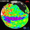
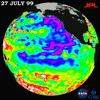
Polar orbiting satellites circumnavigate the earth at a much lower altitude than their geo-synchronous counterparts, but make a complete pass over both poles of the earth (north and south) about once every 100 minutes and cover the entire globe twice in a 24 hour period. As they move from pole to pole, the earth rotates beneath them. Key polar orbiting satellites include POSEIDON/TOPEX, ERS-2, and SSM/I. These satellites are excellent for providing key data about wave and sea heights, near surface wind speeds and direction, making them an ideal surf forecasting tool. The POSEIDON/TOPEX satellite indirectly measures height of the ocean's surface. The data obtained from the satellite, when compared to baseline data, is used to determine how much higher or lower a particular segment of the ocean is from 'normal'. This technique can produce measurements accurate to within less than 1 centimeter. It has been invaluable in investigating the El Nino/La Nina phenomenon (characterized by movement of warm and cold water across the equatorial Pacific). El Nino/La Nina have been found to strongly influence the strength of storms, and therefore, the potential for long-term swell development. An example of POSEIDON/TOPEX imagery is provided below. Sea heights that are above 'below' are depicted in purple, and those above normal are depicted in white. Colder than normal water temperatures are indicated in purple, and warmer than normal water temperatures in white.
POSEIDON/TOPEX Imagery
La Nina depicted in November '98 (large area of cold water on the equator) and then fading a bit on July '99.
Image Courtesy: NASA Jet Propulsion Laboratory
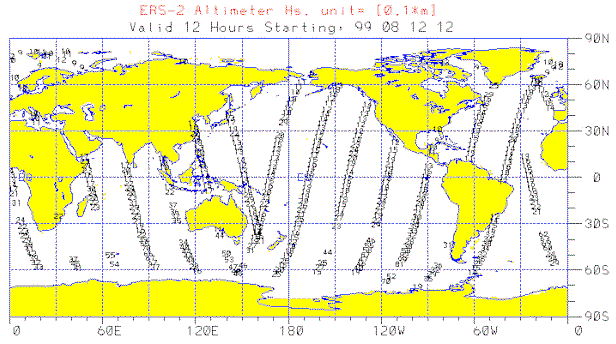
But for surf forecasting, ERS-2 (European Remote Sensing Satellite) and SSM/I sensors are the hands-down winners. ERS-2 measures sea heights, wind speed and direction in thin swaths across the oceans. ERS-2 data is particularly important for monitoring what is occurring on the ocean's surface inside large storms where the view is obstructed by clouds, and where neither buoys or ships are present. Most ships try to avoid storms for obvious reasons, and open ocean depths are so great that anchoring and maintaining buoys is cost prohibitive. The ERS-2 satellite then becomes the primary (if not only) source for confirming sea heights, near-surface wind speed and direction inside a storm. Though it doesn’t provide 100% coverage, it's the best source currently available.
ERS-2 Sea Heights (in meters)
Notice the satellites orbital path over the poles and across the equator
Image Courtesy: NOAA OMB
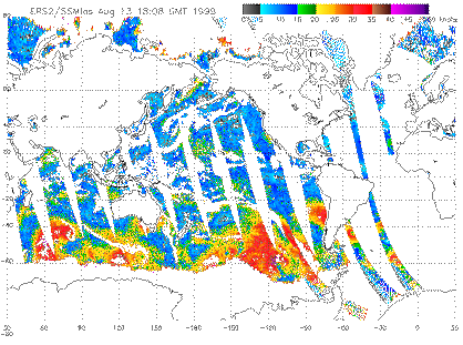
The Defense Meteorological Satellite Program (DMSP) has a F-8 satellite with a Special Sensor Microwave/Imager(SSM/I) on board. SSM/I uses a seven channel passive microwave radiometer operating at 4 frequencies with dual polarization. The SSM/I sensors provide raw data for input to processes that determine average wind speeds, but across much larger areas of the ocean. Though SSM/I does not provide directional data, when used in conjunction with ERS-2 derived wind speed and direction data, a fairly accurate large-scale wind field/fetch analysis can be constructed. Both ERS-2 and SSM/I data is of limited use in tightly packed small-scale systems, like hurricanes. Their technology doesn’t permit processing on a small enough scale to depict the tight gradients and features that are the hallmarks of such systems. But other tools are available in these instances. Therefore, their utility on larger scale systems make them one of the most important tools for surf forecasters.
SSM/I Wind Sensor Image
Notice the large path of red west of South America indicative of winds 30-35 kt with imbedded area to 45 kts. But wind direction is obvious.
Image Courtesy: NOAA OPPT
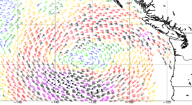
SSM/I and ERS-2 Combined
Same image as above zoomed in and in combination with ERS-2 directional wind data. Notice wind barbs pointing southeast, indicating winds blowing towards that direction at 30-35 kts.
Image Courtesy: NOAA OPPT
On June 19th, 1999 the the Seawinds scatterometer was launched onboard the QuikSCAT satellite into a polar orbit from Vandenburg Airforce Base. This satellite provides a level of detail not previously available. It uses a specialized microwave radar capable of measuring near surface wind speed and direction under nearly all weather and cloud conditions. It tracks over 98% of the oceans surface in a 24 hour period, combining the wide coverage area of SSM/I with the wind direction capabilities of the ERS-2 satellite, all in one pass. The quality and strength of the signal enables QuikSCAT to provide more detail and accuracy than the older SSM/I and ERS-2 technology, making it the de-facto standard for viewing wind direction and speed inside ocean storms. It works well for small systems like hurricanes all the way up to large winter storms. This data is now assimilated into many weather models, improving their depiction of current conditions and making the resulting forecast more accurate. The imagery speaks for itself.
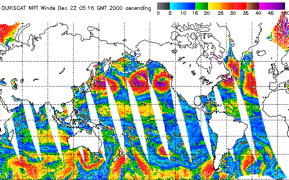
QuikSCAT Global View
On December 22, 2000 notice the three storms tracking eastward across the North Pacific. Much like the SSM/I imagery above, this perspective provides a great overview of global weather conditions. Notice all three storms indicate winds at or greater than 40 kts. But it's the detail provided in the image below that show the true capabilities of the QuikSCAT satellite.
Image Courtesy: NOAA OPPT
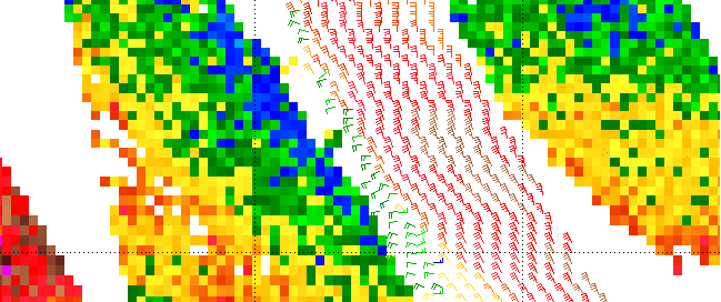
QuikSCAT Close-up View
But when you zoom in, notice how the QuikSCAT image provides wind barbs indicating wind direction and speed for all areas covered (unlike SSM/I and ERS-2). In this example we're viewing the storm from the image above that is just off the US west coast. Notice the strongest winds are in the storms south quadrant with the barbs indicating wind speed of 40-50 kts and all aimed right at Northern CA. (The wind barbs that are black are 'rain flagged', meaning that rain was heavy enough in that area to potentially cause some error in the speed or direction output. Experience indicates that in all but the most extreme cases, the speeds and direction are reliable even when 'flagged').
Image Courtesy: NOAA OPPT
NEXT |